 Built by Klein
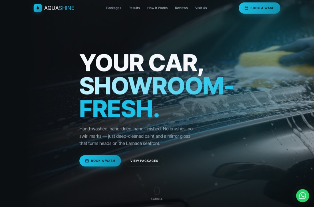
Key takeaways
- The clear majority of Cyprus web visits come from phones, so mobile-first means designing for the phone first and the desktop second.
- Google uses the mobile version of your site to rank you, so a weak mobile experience hurts every search position.
- One-tap calling and one-tap WhatsApp are the two highest-converting buttons a Cyprus business can put on a phone.
- Speed, thumb-reachable buttons and readable type without zooming decide whether a visitor stays or leaves.
01Why do most Cyprus customers find you on a phone first?
Walk down any street in Limassol or Larnaca and count the phones. Locals, tourists, expats, almost everyone searches, books and calls from a handheld screen. For most local Cyprus businesses, the bulk of website traffic now arrives on mobile, often well over two-thirds of it.
The island makes this even more pronounced. Visitors arriving for the summer have no local knowledge, no bookmarks and no time, they search on the move. A holidaymaker deciding where to eat tonight, a new resident hunting for a plumber, a driver needing tyres fixed, all of them are standing somewhere with a phone, not sitting at a desktop.
Mobile-first design simply accepts this reality. You design the phone layout first, where space is tightest and attention is shortest, and let the desktop version inherit from there. Done the other way around, a shrunk-down desktop site, you get the cramped, fiddly experience that loses Cyprus customers every day.
02What does "mobile-first" actually mean in practice?
Mobile-first is not just "it works on a phone". A site can technically load on mobile and still be miserable to use. Real mobile-first design respects how a thumb moves, how little patience a phone user has, and how small the text can get before someone gives up.
The core ideas are simple but ruthlessly applied: the most important action is always within thumb reach, text is big enough to read at arm’s length without pinching, and nothing important hides behind a tiny menu icon. Every tap should feel obvious and forgiving.
- Primary buttons sit in the lower half of the screen, where the thumb naturally rests.
- Body text is at least 16px so nobody has to zoom to read it.
- Tap targets are large and spaced apart, so fat fingers do not mis-tap.
- The phone number and WhatsApp button are visible without scrolling.
- Forms are short, with the right keyboard popping up for phone or email fields.
03How does Google’s mobile-first indexing affect your rankings?
Here is the part many Cyprus business owners miss: Google now ranks your site based on its mobile version, not the desktop one. This is called mobile-first indexing, and it has been the default for years. If your mobile site is stripped down, slow or broken, that weaker version is what Google judges.
In practice this means a beautiful desktop site with a neglected mobile layout will quietly underperform in search, even for desktop users. The content Google reads, the speed it measures and the experience it scores all come from the phone version.
So mobile-first is not only a conversion question, it is an SEO one. Getting found on Google in Paphos or Limassol and converting that visitor both depend on the same thing: a genuinely good experience on a small screen.
04Why is speed the make-or-break factor on mobile in Cyprus?
On a phone, patience is measured in single seconds. Studies consistently show that a large share of visitors abandon a page that takes more than three seconds to load, and on mobile connections those seconds arrive slower. A tourist on a busy 4G network in peak season will not wait for a heavy homepage to crawl in.
Cyprus adds its own twist. Summer brings a flood of visitors hammering the same networks, and many people browse on older or budget phones. A site stuffed with huge images, autoplay video and bloated scripts feels fine on the agency’s fast office wifi and painful on a tourist’s phone by the beach.
- Compress and correctly size every image, the biggest mobile speed killer.
- Avoid autoplaying heavy video on the first screen.
- Cut unnecessary scripts, pop-ups and third-party widgets.
- Test on a real mid-range phone on mobile data, not just office wifi.
05Why are tap-to-call and tap-to-WhatsApp non-negotiable?
Cyprus runs on WhatsApp and phone calls. People do not fill in long contact forms and wait two days for a reply, they tap a number or message you on WhatsApp and expect an answer the same hour. Your mobile site has to make that one tap away.
A clickable phone number that opens the dialler, and a WhatsApp button that opens a chat already addressed to you, remove every bit of friction. No copying numbers, no typing, no thinking. This is, by a wide margin, the highest-converting thing you can add to a mobile site for a local Cyprus business.
Put these buttons where the thumb already is: a sticky bar at the bottom of the screen that follows the visitor as they scroll. The moment they are convinced, the call is one tap away, whether they are reading your prices or your reviews.
- Use a real tap-to-call link so the number opens the phone dialler.
- Pre-fill the WhatsApp message with your business name so chats start instantly.
- Keep a sticky call/WhatsApp bar visible at all times on mobile.
06What mobile mistakes still cost Cyprus businesses customers?
Most mobile failures are not exotic, they are the same handful of avoidable errors repeated across the island. The good news is that fixing them is usually quick and the payoff is immediate.
The classic killers are tiny text that forces pinching, buttons jammed so close together you tap the wrong one, pop-ups that cover the whole screen with a close button you cannot find, and phone numbers saved as images so they cannot be tapped. Each one quietly sends a ready-to-buy customer back to Google.
- Text so small visitors must zoom to read it.
- Buttons and links too close together to tap accurately.
- Full-screen pop-ups with a hidden or microscopic close button.
- Horizontal scrolling because something is wider than the screen.
- A phone number that is an image, not a tappable link.
07How do you check if your site is truly mobile-friendly?
You do not need expensive tools to start. The most honest test is to pick up your own phone, open your site on mobile data rather than office wifi, and try to do what a real customer would: find your prices, call you, message you, book you. Time how long it takes and notice every moment you hesitate or have to zoom.
Then hand the phone to someone who has never seen the site, your mother, a friend, anyone, and watch silently. Where their thumb hovers, where they squint, where they give up, that is your to-do list. A second opinion catches the things you have stopped noticing.
For a harder check, run the page through Google’s own mobile and speed tools, which flag slow loading, text that is too small and tap targets that are too close. Built by Klein does this kind of mobile audit as standard, but you can spot most of the wins yourself in ten minutes.
Mobile-friendly websites in Cyprus: frequently asked questions
A mobile-friendly website loads fast, fits the screen without horizontal scrolling, uses text large enough to read without zooming, and puts key buttons like call and WhatsApp within thumb reach. In Cyprus, where most visits come from phones, it should also offer one-tap calling and messaging for instant contact.
Yes, directly. Google uses mobile-first indexing, meaning it ranks your site based on its mobile version. A slow or broken mobile experience lowers your position in search across Paphos, Limassol and Larnaca, even for people searching on a desktop.
Aim for under three seconds, ideally closer to two. Many mobile visitors abandon a page that takes longer, and Cyprus summer traffic plus older phones make slow sites feel even slower. Compressing images and cutting heavy scripts are the fastest ways to get there.
Because Cyprus runs on WhatsApp. Customers prefer messaging over forms and expect a quick reply, often the same hour. A one-tap WhatsApp button removes all friction, turning an interested visitor into a conversation before they leave for a competitor.
A single responsive website is the modern standard, not a separate mobile site. One site that adapts cleanly to every screen is easier to maintain and better for SEO. The key is that it is designed mobile-first, so the phone experience is the priority, not an afterthought.
Open it on your phone using mobile data, not office wifi, and try to call, message and find your prices like a real customer. Then run it through Google’s free mobile-friendly and speed tests. Hesitations, zooming and slow loads are your fix list.
Written by
Built by Klein
Web, SEO & marketing agency in Paphos. We build websites that get found in Cyprus — on Google and in AI search.
Discuss a project